Welcome to my A2 Media blog. On this blog you will see three of my productions for a horror trailer, poster and a magazine front cover that features my characters. To navigate you can either go to the top right hand side where you will find titles that you can click on, for example: Outline and Inspirations. Or you can scroll to the bottom and in order to get on the next page you can click on "Newer Posts" or "Older Post".
Thank you, have a good day and I hope you are pleased for what you see.
Friday, 2 May 2014
Thursday, 1 May 2014
Final Magazine Cover

Final Poster

As you can see I've changed the font and added a few more changes, the names on top and the icons at the bottom. The reason why I have an hour glass on the bottom left hand side is because my production name is Hour Glass studios which is in the writing and I've added the age classification for my target audience to see.
Sunday, 27 April 2014
Friday, 25 April 2014
Thursday, 24 April 2014
Wednesday, 23 April 2014
Monday, 21 April 2014
Evaluation Question 5
How did you attract and address your audience?

Direct Address-The main way that I have addressed and attracted my audience to my production is the use of direct address as all of the attention is on them and no one else, which adds a sense of personal attachment. For my magazine, my main lead image is staring my audience directly through her eyes, and her hand seems like it is about to pop out of the page to grab them. Through her facial expressions there is a sense of the main character pleading for the audiences help as the other hands are trying to grab her and bring her into the darkness. Another use of direct address is by the Skyline that points out in an emerald green that the top 50 films were “voted by {them}” this adds a personal touch as it creates a feeling that the audience is in control of what it is being featured in the magazine and that their opinions matters.

My poster creates a similar idea of my audience being in charge and needed by the use of my anchorage text and main image. Having my main image held in an innocent pose with her finger over her mouth portrays a loss of innocence, but whilst looking directly at my audience suggests that she is telling them to keep quite or they’ll be next. My anchorage text of “play her games, she plays with your life” backs this idea up that it’s up to my audience to get involved or not. This adds a personal touch as again they control what is going to happen as it’s their choice.
In all of my productions there is a way that my audience can relate with the characters whether it’s the main girl on my cover, the little ghost girl in my poster or the characters being featured in my trailer, as they are all (apart from the little girl) in the same age range of my target audience and they alike my characters they may also be deciding what there next steps are in the future. My audience can relate to my main character on the magazine cover as she looks like a normal average teenage girl, she cares about her appearance, but isn’t covered in make up with her hair done up like a prime celebrity idol, instead she is in casual clothing, loosely styled hair with a touch of simple make-up. This leaves the impression on my audience that this girl could be them and what happens to her could happen to them. My poster however can be used for a different relatable source as the little girl is wearing a simple nightdress with lose, but styled hair, this can leave an impression that this little girl can be their sister or an average little child walking down the street. This can also introduce the everyday vs. the ghastly among the unknown fears as this little girl could be your neighbour or sister, but because she’s posed innocently with a hint of menace in her eyes it adds a ghastly effect and an unknown fear because of the fast that she could be anybody.
 When looking at my trailer, my audience may be able to instantly relate with my characters as they are average looking teenagers who are looking to settle down at their new home, which could be them in either a few years or a few months. None of my characters are styled to look like celebrities that have enhanced there features, there purpose is to look like every day teenagers with a personality and excitement about them. One of my characters films there new start to their new home, media fanatics or amateur film producers may be able to relate with her as they see themselves in her as she represents their own ambitions and motivation to become who they want to be.
Colour-
When it comes to attracting the audience’s attention for either a magazine or poster the main things are:
- · The Text
- · The Image and the effect it has on them
- · The colour patterns
Colours tend to be the main eye catching technique to gain their attention, if a magazine is just white with a little bit of colour coming from the masthead and the main image of someone posing, I believe it won’t gain there interest and they’ll probably just walk away, however if a magazine has an interesting mix of colours then and an image that really stand out then customers may become intrigued. My colours may appear simple, but there connotations may raise questions and that may make audience intrigued. For example the main colour for the back ground is black, where some may think it’s dull and lifeless, the connotations speaks differently… black tends to connote darkness, death and danger. However my use of black connotes power as the hands pop out of the page in a powerful force ready to lure her back in and it also connotes mystery. This is the main effect that gains my audience’s attention as it raises questions on what’s going to happen to her, what kind of thing lurks beneath the darkness and why are they trying to grab her. Other colours help back up this idea of mystery and danger such as red and white, two colours that tend to be peaceful and innocent colours, but they also connote mystery, suspicion, danger and death (blood).

My poster hosts a mix of black, yellows/ orange, pinks and white which all have a different connotations and different effects on the poster. Orange usually connotes warmth, energy, determination, happiness and success, but due to my orange seeming vague, misty and unclear it connotes determination and a strange sense of warmth against the coldness. The pink helps connotes love, passion and romance, but it also connotes passiveness, this colour is normally referred as the stereotypical colour that girls wear this helps imply the innocence that the little girl brings across. After already mentioning the use of black as being mysterious and dangerous, the use of white tends to connote the exact opposite and helps imply the idea of innocence as white connotes purity, health, perfection, goodness and of course innocence.
Tuesday, 25 March 2014


Monday, 24 March 2014
Saturday, 22 March 2014
First Draft of my Trailer
This first draft is basically a template on what I want my trailer to be like, I want to keep few of these clips as some of them capture what I want. I personally feel like this seems rushed, uninteresting and if it came on TV I may change the channel over as it doesn't capture my complete interest. There isn't any sound that captures the atmosphere or anything like that.
Feedback:
"I like it, but it's just 'meh', it's good for a first draft, but I recommend more sound and a text commentary such as: People said it was going to be easy... If you get my drift, but no it's good, but it needs a lot of work on it"
"I like the clips, but the pacing is either too fast or way too slow. Truthfully if this came out as it is now I wouldn't want to watch it"
"It appears interesting, but theres a lot missing such as music that isn't just a voice over... there isn't any texts or effects, if I were you I would see if you can get a recording effect, like a timer or something."
"I like the way the title forms at the end, but it doesn't appears like a trailer, more of a business video or something... yeah I would change that"
Friday, 21 March 2014

Friday, 14 March 2014


Tuesday, 11 March 2014
New font

I like the other fonts, but prefer the idea to the type writing due to the fact that my characters are students during the vintage era where victorian styles are coming back.
Friday, 7 March 2014
New Poster

As you can see, I have used the same image, but changed the fog to a serial surroundings of what looks like a house with an eerie light hanging over the opaque ghost who is in a menacing position. It portrays innocence by using the little girl, but that's juxtaposed by her position as she uses direct address, almost like a warning to the audience. The text makes it seem like an old victorian era, so it makes it look like it's been used on a type writer, which creates and old feeling.
Feedback:
- "I like it, i like the way the font is wide spreed across the page, but I don't like the style of the font."
- "Not sure on the review up top, you don't really see them like that on a normal poster"
- "She looks to photoshopped, change the lighting and make her blend in with the back ground"
- "I would see that if that was real, make the you repeat bit bigger though because I can't read it"
Tuesday, 4 March 2014

Monday, 3 March 2014
Photo shoot collage for Poster image


I went with this image because I believe that it works the best as she looks menacing, but also very innocent which hopefully will play with the audiences mind extremely well. Also with this image I can have more room to move her about as I took a high angle shot that included the floor which I will need to make a version of the typical gothic features- Every day vs Ghastly and the Unknown fear of what happens in that particular every day room.
Friday, 28 February 2014
Research
During the process of making my trailer, I decided to watch some "real" videos of ghost caught on camera to do with children for some inspiration. This video helped me come up with some ideas to play around with some old children's toys such as a rocking horse, toy box, dolls house and a maybe a rocking chair that would be found in the new house that my characters move in to.
This video may be fake, but the whole idea of the toys moving on there own and towards the end when the TV turns on, on it's own and then the rocking chair moves faster, adds a creepy atmosphere.
Currently I have got in touch with a local vintage shop that has all the products from the old era, such as old fashion clothing, tea sets, old sewn toys and many more. This shop has given me permission to go over and borrow a few items for a day. The things I have borrowed is an old rocking horse, a spinning top, dolls house with the dolls and items, an old teddy and a metal trunk for some items to go in it.
Here are the objects that I have borrowed and the shop it belongs to:
 From this image you can see some items that I have borrowed from the shop, such as the Old Trunk, The old teddy bear and a spinning Top. I also borrowed a rocking horse which I used further on in my trailer and an old dolls house, which my audience can get a perfect view off:


This video may be fake, but the whole idea of the toys moving on there own and towards the end when the TV turns on, on it's own and then the rocking chair moves faster, adds a creepy atmosphere.
Currently I have got in touch with a local vintage shop that has all the products from the old era, such as old fashion clothing, tea sets, old sewn toys and many more. This shop has given me permission to go over and borrow a few items for a day. The things I have borrowed is an old rocking horse, a spinning top, dolls house with the dolls and items, an old teddy and a metal trunk for some items to go in it.
Here are the objects that I have borrowed and the shop it belongs to:
Thursday, 27 February 2014
Tuesday, 25 February 2014
Update- Changes to my cover

 |
Due to the change of actors from my previous post, I have had to change my front cover as the girl I had before, never actually featured in any of the filming. As you can see, the design is the same, as I was attached to the idea of the girl reaching out to the Audience, grasping help before she is dragged in the shadows. I am currently indecisive about whether or not the new actress will be in Black and White or not, due to there not being a lot of colour that really stands out, however the fact that she is Black and white, does add the feeling, that it is the old fashioned films of 1960's trying to reach out to the modern era. I have also change the "Exclusive" part as I felt like even though the yellow stood out on the magazine, it seemed to attract a younger audience, which isn't what I am trying to achieve. So instead, I am going for a simple, bold and bright stand out word that should attract my main audience.
Feedback:
- "I prefer the left version, the girl on the right looks out of place and just put there for no reason, but I do like the way the one on the rights hand is more forward and her face looks more affraid than the one on the left"
- "I don't think the "Top 50" should be in black and white because it's easy to miss that it's there and doesn't do it for me"
- "I like the one on the left more, she looks more surreal than the one on the left, plus she doesn't look like she's just placed there"
- "Hmmmmmm I like what you are trying to accomplish with the black and white, but I like the one on the left better"
Friday, 21 February 2014
Friday, 14 February 2014
Trailer Questionaire
Recent Updates
I have had to change quite a lot of my course work as my two main actors have changed, meaning that my front cover will have to be done again, but with a different person. I would like for them to have the same pose and position as it works with my layout, but I may have to play around with different ideas. Within changing two actors, I've had to find a replacement for my main character and my little ghost girl, I am currently filming now, but I have changed my ideas from now having two ghost girls who are sisters. This works better than my original plan of my first ghost girl. The little girl that I am using is younger, therefore works better when it comes to playing with my audiences mind.
Friday, 7 February 2014
Urgent. Feedback needed.
Hello, may I please have some feedback on these sayings. Which ones do you think is most disturbing for two ghost girls to say during a ouji board session:
Can you help me?
It's dark in here?
It was an accident?
Don't leave me
We didn't mean to do it
I just want to play
Thank you.
Can you help me?
It's dark in here?
It was an accident?
Don't leave me
We didn't mean to do it
I just want to play
Thank you.
Tuesday, 21 January 2014
3rd Draft

Feed back:
- "I like the hands in the back, it creates the feeling that she's going to be taken into the darkness, but I think theres to much writing on the left hand side"
- "The reel is clever and it's a good way of showing whats in store, plus it ties nicely with the title"
- "What's the film name? Because I can't see it"
- "I agree with the fact that theres to much writing, but it's a good layout"
Sunday, 19 January 2014

Tuesday, 14 January 2014
Starting to Edit- First Draft
From the two examples before, I have decided to take the one where it looks like the main character is reaching out to the audience almost like a plead for help as something lurks in the shadows. I believe this is more effective for my audience because it's almost like a motion shot, instead of the main actress posing and looking delicate.


Friday, 3 January 2014
Day 1- Taking & Preparing- Part 2
I will hopefully use 2 of these pictures, due to my lack of deciding what layout I want my magazine to under take at the moment, I decided to take different approaches by following my drafts below, with either a single person on the front cover or 2 people to create an action shot:


I can't decide out of these two layouts, I like the idea of just one single actress on the screen because it will catch the audiences eye as it seems like the actress wants to tell you what is in her story, but then I have the second layout where I have too people which will be my main actress and the little ghost girl creeping up on her, I got the inspiration for this layout from Empire front cover that featured The Hobbit which is brilliant because it looks like it is in mid action of a real shot and can make it more eye-catching and interesting because it creates the impression of The Unknown as the main actress hasn't got as clue on what lurks behind her and works better with my audience then the single actress.
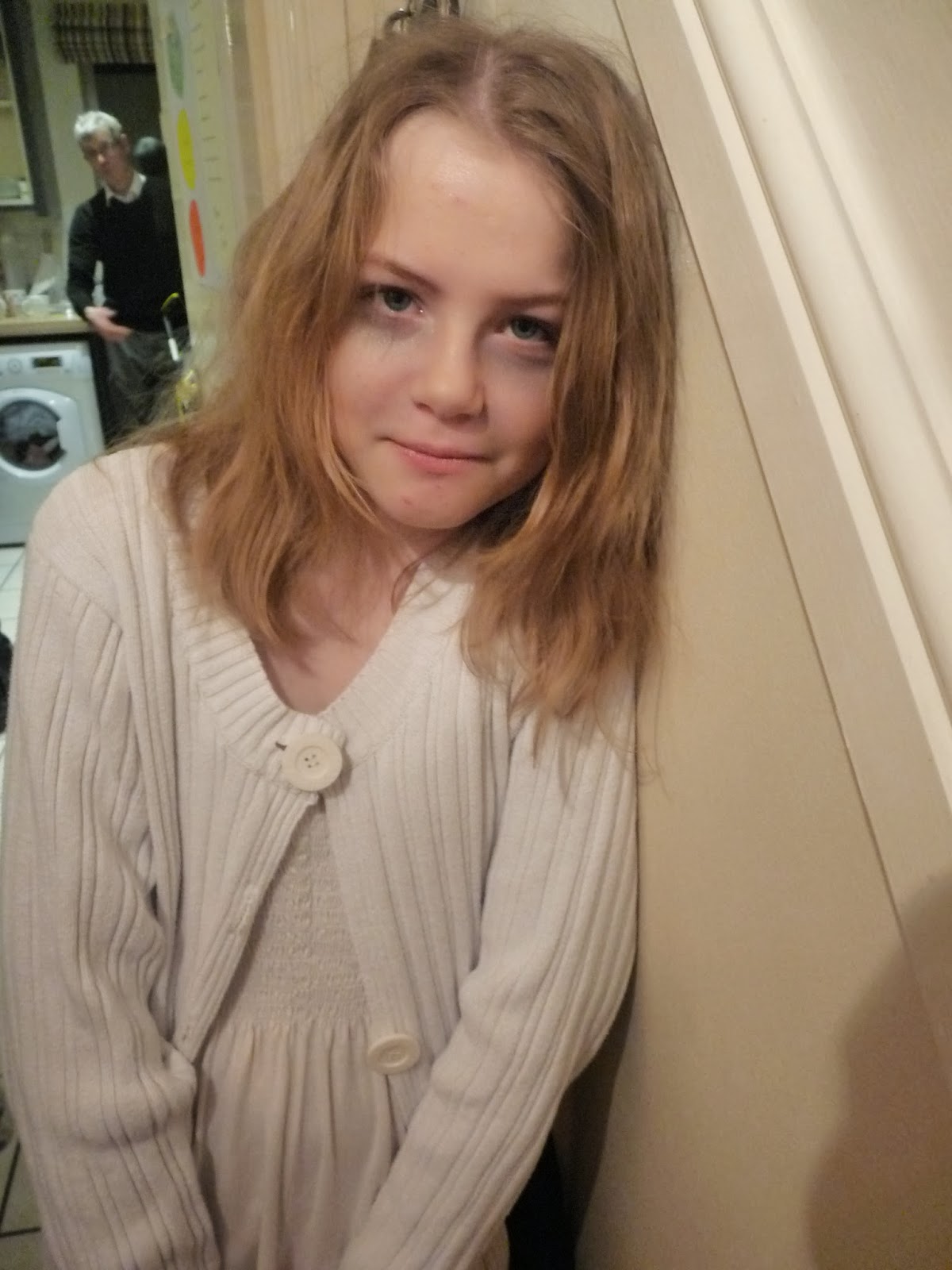
Day 1- Taking and Preparing- Part 1
It's the start of finally making my project. I am going to blog my things a little differently so I can explaining everything that is going on. These pictures are of my new mini actress getting ready for her photo-shoot as her role is of my troubled ghost girl.
 My make-up artist is making my actress Abbey into a troubled little ghost girl who has been troubled in her journey of passing over.
As you can see my clothing for Abbey is all white to create a connotation of innocence, purity, light and goodness. However I want to play on this effect that it will have on the audience because the make-up and on how I am going to present Abbey will alter the first impression of innocence to darkness and pure evil.


 For my first photo-shoot this is a simple look with darkness under her eyes, creating the impression of torment, insomniac and troubled mind which works perfectly for the role I want Abbey to undertake in The Unidentified.
However next time when it comes to making Abbey into my little tormented Victoria I will have her a little more pale and more effects on her face to create full on bags under her eyes and find a way to make her look highly troubled and tormented, to mainly horrify my chosen audience. Plus if I play my cards right it will work perfectly when filming the trailer as the light will have many effects on her face and the expressions she will show.
Subscribe to:
Comments (Atom)